Why did the disability pride flag change?
If you're a new visitor to this advocacy website, this page aims to increase public understanding of those with disabilities and other conditions.
We suggest you seek a licensed professional counselor or healthcare provider for anything you read on this site.
This week, Living With Disabilities will touch base on the change of the Disability Pride Flag and Why the Flag made a transition from its original design to a new design.
Change for the better or change is beneficial are phrases that we have all heard. Any way you phrase it, it all means exactly the same thing.
If you have not read or listened to What's Disability Pride, It's highly recommended that you do so. The ADA celebrated its 33rd anniversary on July 26th, 2023, 33 years after former President George H.W. Bush signed it into law.
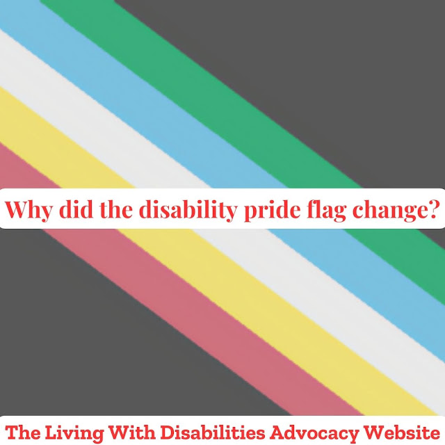
What else comes to mind when you think about the ADA? The Flag of Disability Pride. Let's discuss the Disability Pride Flag's new design and what the colors mean.
The charcoal-gray backdrop pays tribute to and acknowledges the lives lost as a result of ableism, violence, negligence, suicide, rebellion, illnesses, and eugenics. Along with rage and protest, the background shows the treatment of disabled people.
The diagonal bands that cut across the walls and barriers exclude persons with disabilities from society. It also stands for the ableist darkness-piercing creativity and brightness of the disability community.
The stripes representation
Green: is for those with sensory impairments, such as those who are blind, deaf, or both.
Blue: portrays psychological and emotional difficulties.
White: stands for hidden and untreated disabilities.
Gold: is for neurological diversity.
Red: represents Physical disabilities.
So, why was the change in the disability pride flag made by the designer Ann Magill in 2019 and changed from a zigzag (lighting blot) to a horizontal one in 2021? For people who have neurological conditions, the zigzag designs can offset their conditions. And can cause migraines, vomiting, vertigo, seizures, etc. Vertigo and seizures are conditions, and their symptoms are on the Gold neurological spectrum.
Living With Disabilities Presents: The Advocacy Table
a space created for people with disabilities to be able to have freedom of speech and talk on different topics surrounding the disability community. To get more details, check out The Advocacy Table. To become a panelist, Write into the show and let the host know what topic you want to talk about. She will then send out a group email to all panelists after the show has reached five or ten people. After the show, a survey will be emailed to you, and we would love to get your feedback.
If you need online support, Disability Safe Haven is great for receiving support. The We Care Team is very protective of its members and asks everyone who joins, to have a profile picture and answer the security questions.
Podcast link


Comments
Post a Comment